
Brand Refresh
Brand Identity • Art Direction • Graphic Design
Education Credit Union with Kearley & Company
A Texas Panhandle-based credit union needed a refreshed brand identity with a more modern look and feel that kept its core identity intact.
I had the opportunity to lead this project and play a crucial role in its execution. My contributions included conducting competitor and market research; developing the color palette; creating visual standards, including an icon library, imagery guidelines, and design elements and motifs; owning the art direction and design of how the brand identity would be executed across multiple channels; creating an updated brand guide; and assisting in the pitch to the client.



The challenge
Striking the right balance between old and new that would allow the client to maintain its well-earned brand equity while also elevating its visual identity.
The solution
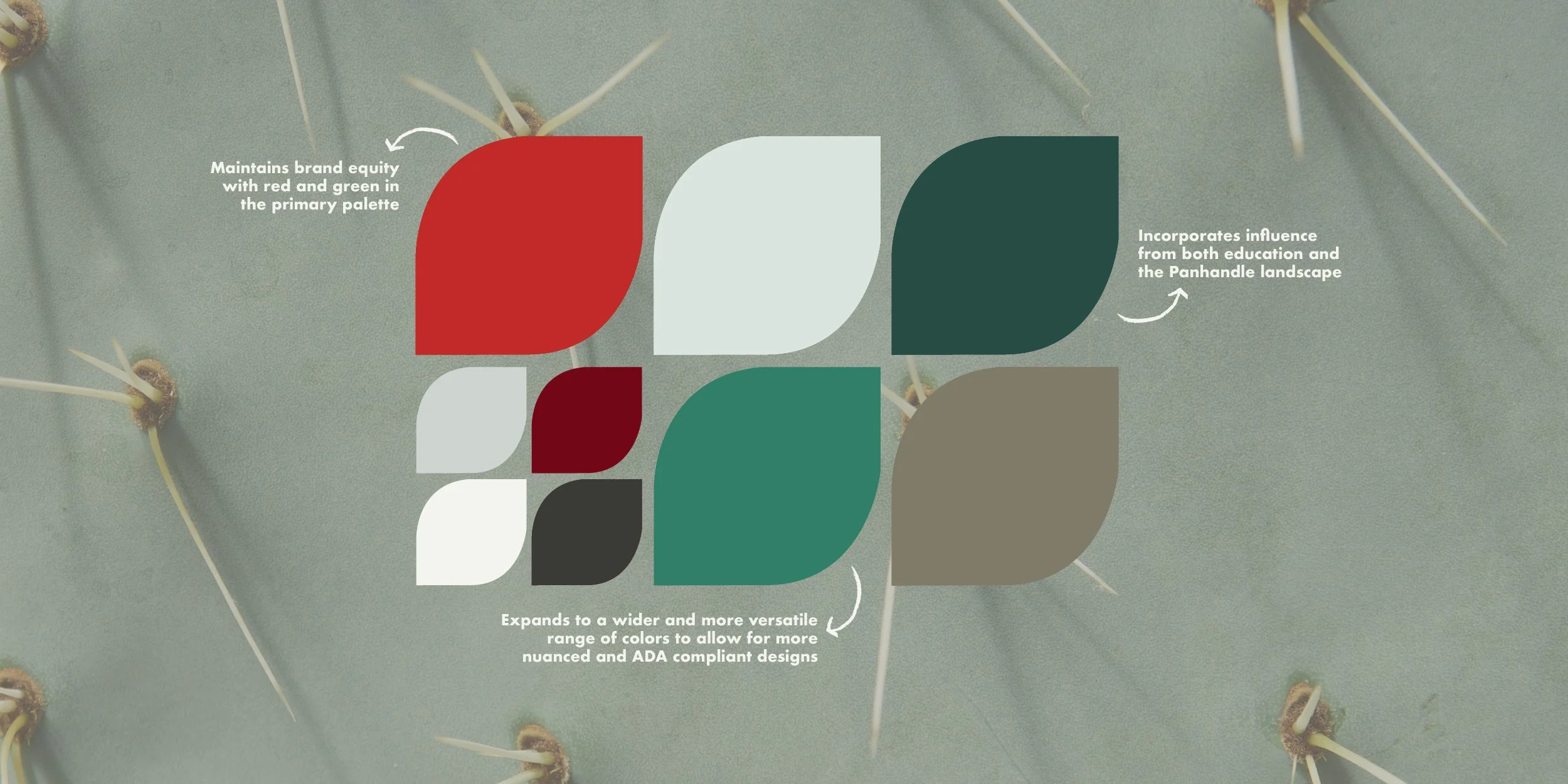
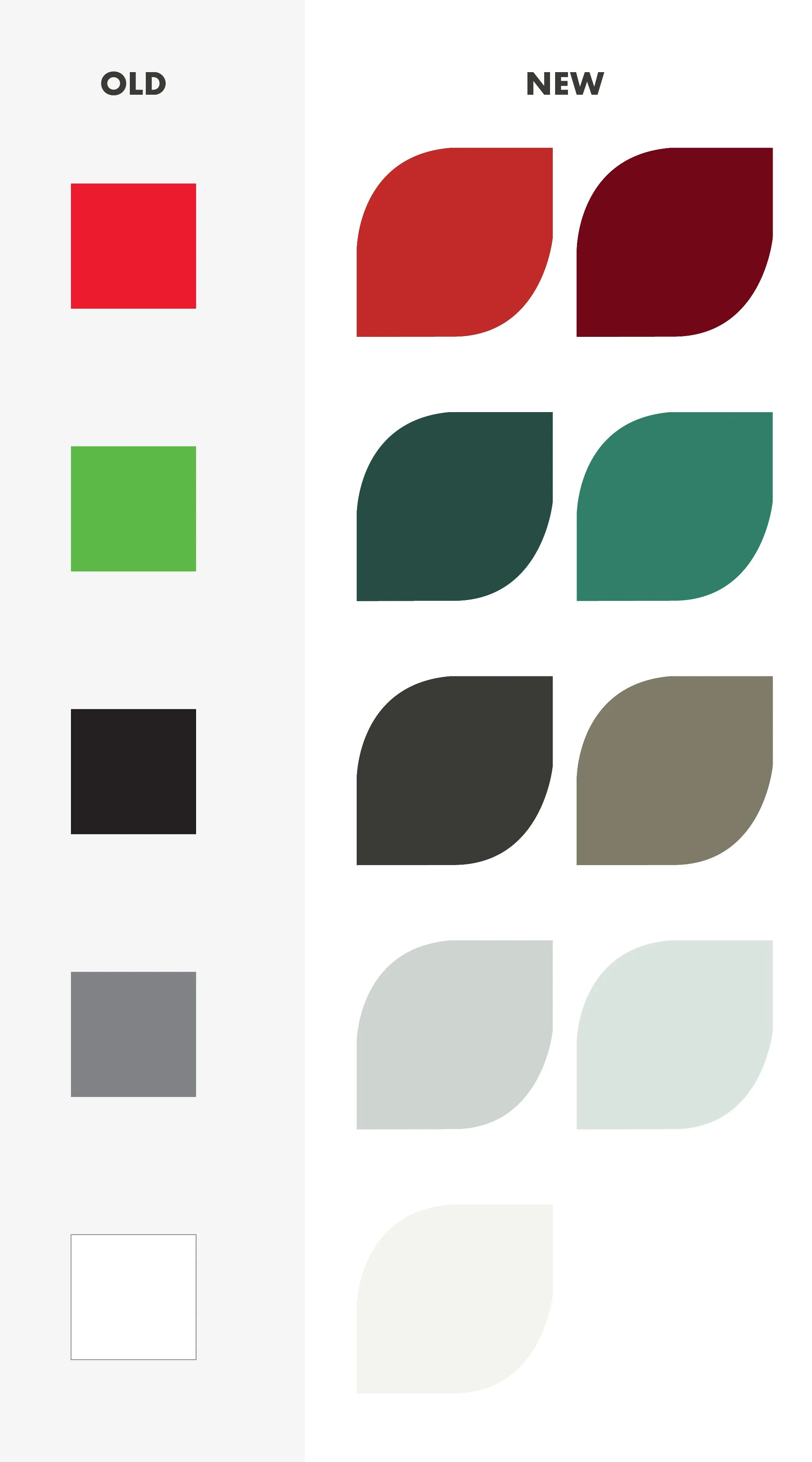
The blueprint of the palette stays the same but shifts to enhanced colors that are still vibrant, fun, and allow the brand to be recognizable.
Visually restrictive → a tonal palette with increased pairing options
Outdated and stark → modernized, toned down, and more versatile colors
Red and green centric → reds and greens that are still familiar but are subtly referential to the credit union’s current membership base, the Texas Panhandle
The outcome
A refined color palette that gives the brand a friendly, down-to-earth, reliable, and energetic personality; makes the brand unmistakable and distinguishes the credit union from its competitors; and honors the past while looking to the future.





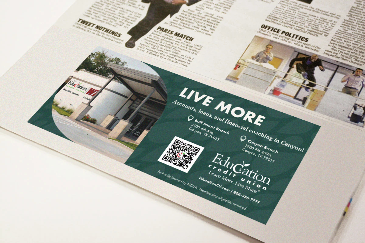
After the groundwork was laid with the new color palette, additional elements—patterns, motifs, and textures—were created to add visual and tonal support and depth to the refreshed identity. The brand was pushed into a full system, continuing to build off well-earned brand equity while establishing a clear, cohesive, and consistent visual identity.
Four patterns supporting one mission.
Four themes centered around the credit union’s mission, membership, and services provided a framework to develop four patterns that gave explicit visual context to the theory behind the color palette.
Education: The credit union is invested in the education community. Though its membership base has expanded from serving teachers, the credit union continues to serve through volunteer hours and support for schools, organizations, and local initiatives.
Financial: The credit union is a not for profit financial cooperative. It returns profits to members in the form of better rates and low or no fees.
Celebration: The credit union is here to help you succeed. Being member-owned means we celebrate your successes with you.
Panhandle: The credit union is proud to be the largest credit union in the region. Membership is open to anyone who lives, works, worships, or attends school in the Texas Panhandle
Each pattern was carefully crafted to be consistent and adaptable. A customized collection of patterns was developed, overlaid onto each color in the palette. To ensure legibility in any use case, the overlay is subtle enough to avoid being overpowering and distinct enough to remain visible.


A set of patterns grounded in the credit union’s mission: to love our people with smarter banking.






Motifs derived from the logo.
Considering the credit union’s logo would remain unchanged, the consistency provided an excellent opportunity to capitalize on existing brand equity. Drawing from the already recognizable design of the logo, visual elements were pulled out to create additional patterns and design motifs. Upon separation from the logo, these elements take on a life of their own that allow them to survive independently and to offer a wide range of use cases, while harnessing and expanding brand awareness by being directly linked to the existing logo.



Textures honoring the credit union’s legacy.
Because of the historical importance of teachers to the credit union, along with its continued support of and distinct presence in the education community, additional textural elements were developed that are subtly referential to the credit union’s roots. These textures benefit from the contextual support of the credit union’s name and logo but are vague enough to avoid being explicit, overstated allusions to education. Two items at home in the classroom, a chalkboard and grid paper, inspired the creation of these two textures in Adobe Illustrator.


Design elements providing cohesion and depth.
Inspired by the shape of the logo, another element was created in addition to those extracted directly from the logo. Designed to be highly versatile and easily adaptable, this element transforms into countless shapes as it is applied to various layouts and dimensions. Despite their variable appearance, these shapes are united by the parent element and create a visually consistent thread that runs through each design, overall contributing to building a deeper, more nuanced visual identity.



The outcome → a multifaceted visual identity with a refined color palette and a wide range of adaptable patterns, textures, and motifs
The impact
Preserves existing brand recognition and consumer trust while giving the brand a fresh, modernized energy
Aligns the brand more accurately with its current audience and clears up confusing messaging
Reduces the likelihood of creative fatigue by leveraging the deeper, more nuanced visual identity

Brand Identity: Christine Marquez • Art Direction: Christine Marquez • Graphic Design: Christine Marquez + Daniel Buenger • Copywriting: Jay Overstreet