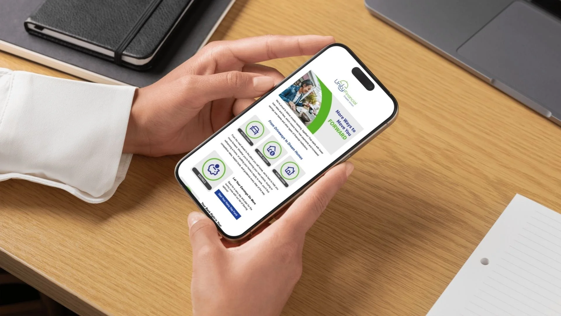
Logo design and rebrand
Logo Design • Brand Identity • Art Direction
Unity Financial Credit Union with Kearley & Company
To accompany a strategic brand repositioning, the client needed a new name, logo, and brand identity.
Formerly known as Healthcare Financial Federal Credit Union, the client’s membership base was previously limited to the hospitals it served. With its repositioning, the credit union expanded its field of membership to include anyone who lives, works, or worships in a specific geographical area. While the core purpose of the credit union would not change—helping those who help others—the name and brand identity needed to be updated to reflect the expanded field of membership and to speak to the new target audience.

The new name
Alludes to the larger, unified membership base and connects to the credit union’s core purpose.
Increases ability to enter new markets and speak to diverse customer segments.
Reinforces the message that at Unity Financial Credit Union, you’re not just a member; you’re a part of something bigger.
The challenge
Designing a logo that supports the charter conversion and speaks to the new, more diverse member base; that increases member confidence and preserves trust; and sets the credit union up for long term growth with a modernized brand identity and reflects the credit union’s fun, people-first personality.
The process
-
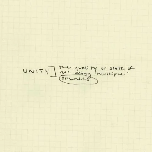
Unity is a common theme that can become cliche very quickly. Therefore, I chose to avoid generic, overused symbols such as circles, clasped hands, or interlocking shapes.
-
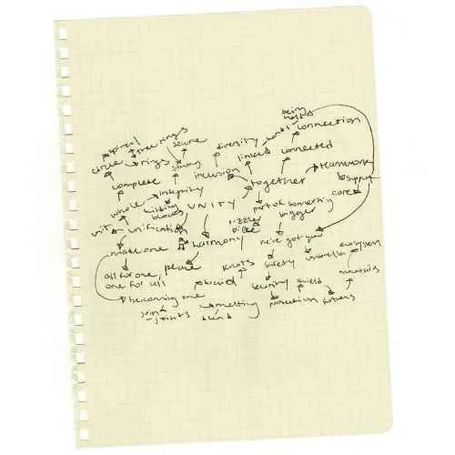
To push past common symbols, I created a mind map to explore potential connections and references.
-
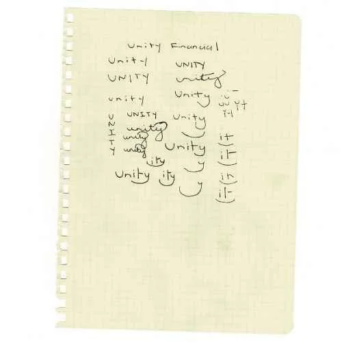
In my initial sketching, I discovered the opportunity to create a subtle winking face within the type that made its way to the final logo.
-
The initial draft of the logo derived the shape of the umbrella from the shape of the “U” and played up these curves.
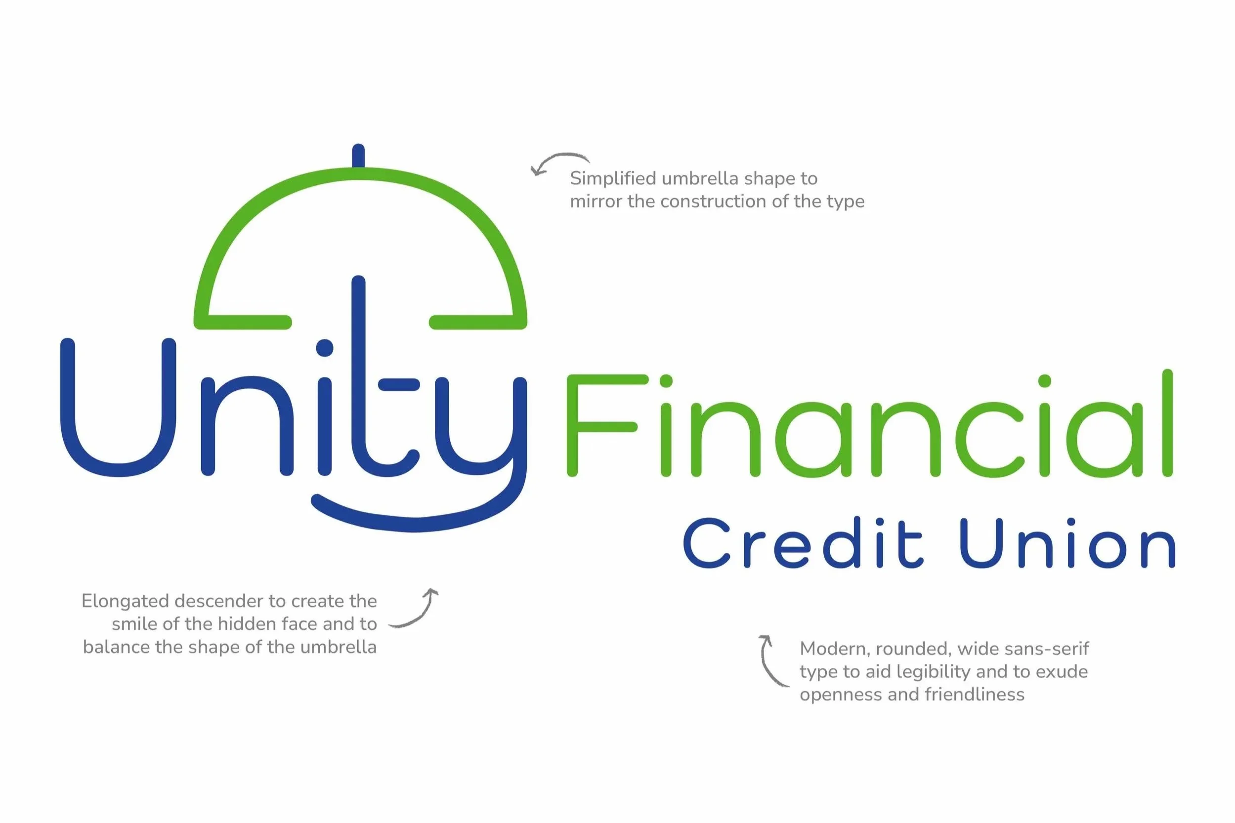
The solution: a new logo with a unified message
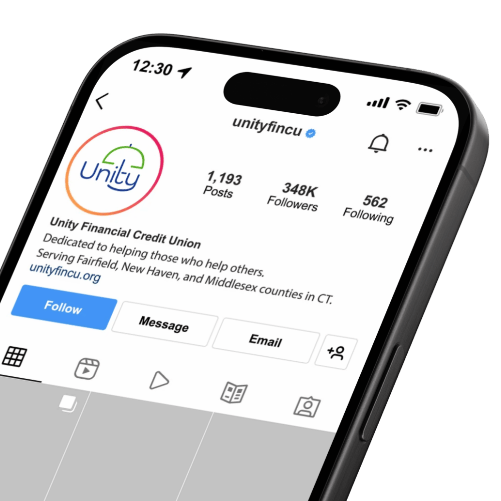
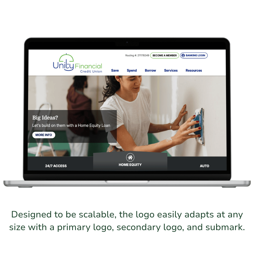
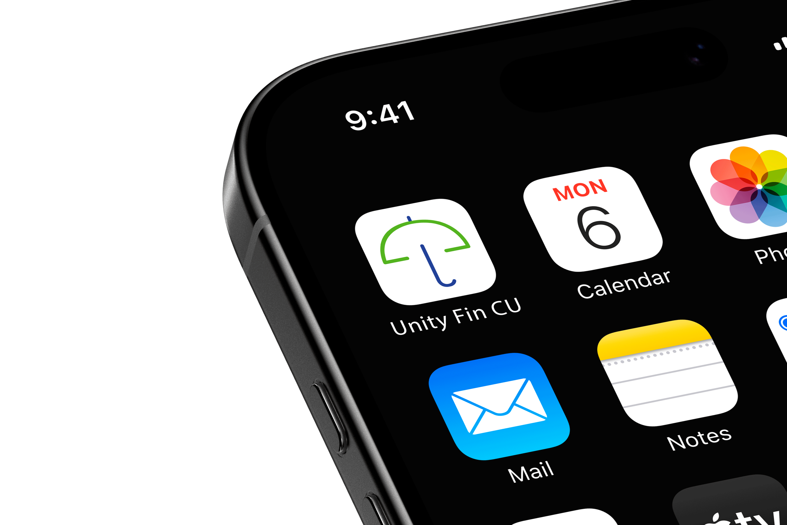

Why an umbrella?
Symbolizes care, security, and inclusion, which ties to the core purpose and new membership base of the credit union, as well as the services it provides.
Directly connects to the message that drove the choice of the credit union’s new name: at Unity Financial Credit Union, you’re not just a member, you’re a part of something bigger.
Communicates that the credit union is about more than just finances; it’s about relationships, support, and helping at every stage along the way.
Stay tuned… more coming soon!
Logo Design and Brand Identity: Christine Marquez • Art Direction: Christine Marquez • Graphic Design: Meredith Cody • Copywriting: Jay Overstreet • Email Lead: Jordan Guilmart • Web Design: Jonathan Patterson